Planned vs Actual Chart offers an insightful overview of a team's performance over a specific timeframe. It's designed to empower team leaders and managers with the ability to compare the team's capacity against the work that was planned and the work that was eventually delivered.
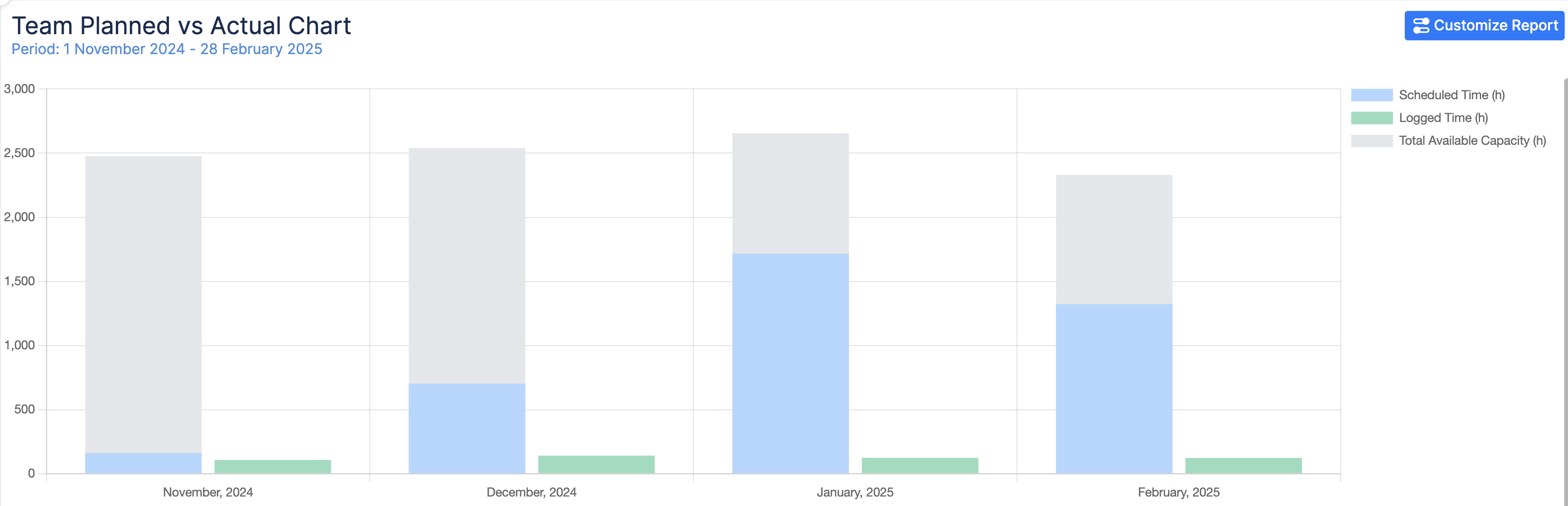
Chart Overview
Here’s what it does:
-
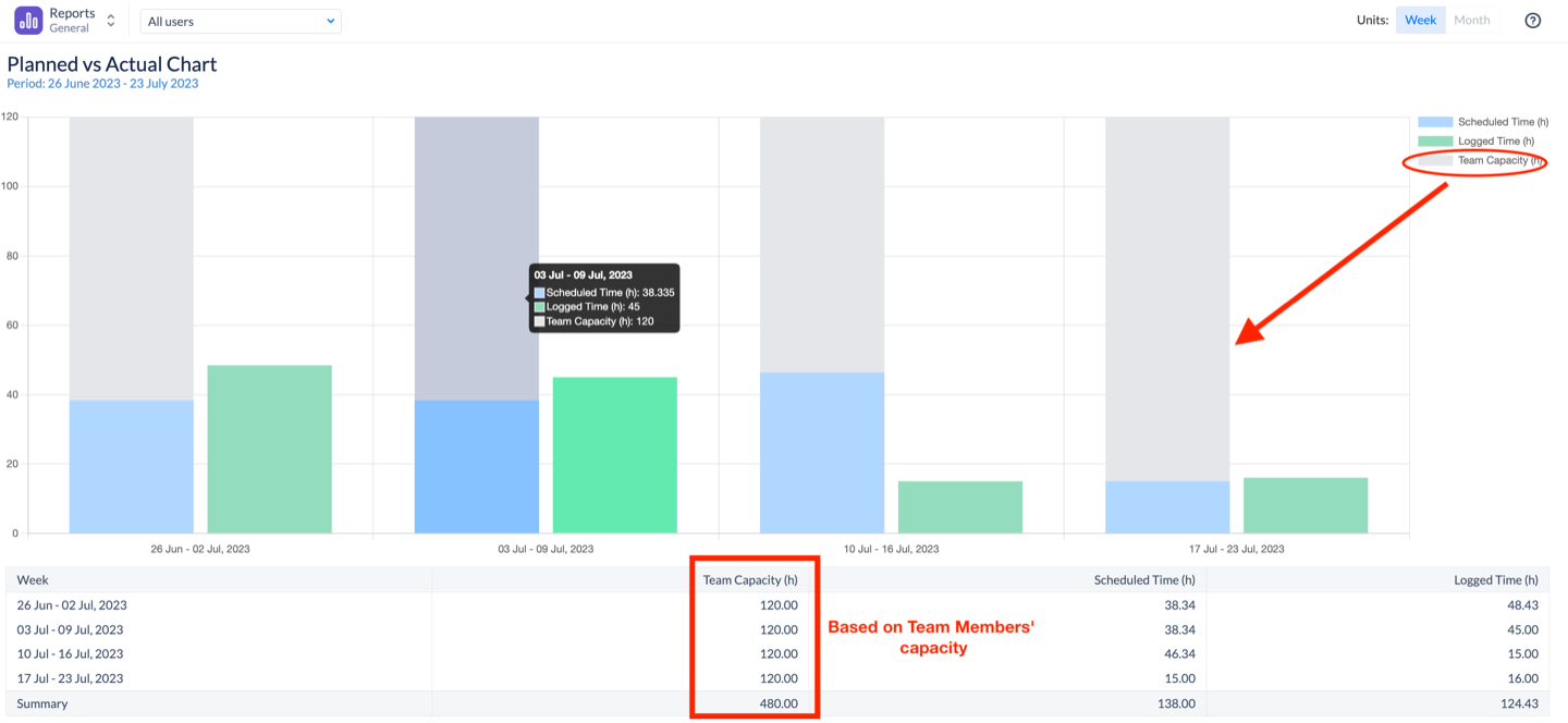
Team Capacity (only when reporting by Team): This represents the maximum workload a team can handle during the selected period. It's based on the combined capacities of all team members.
-
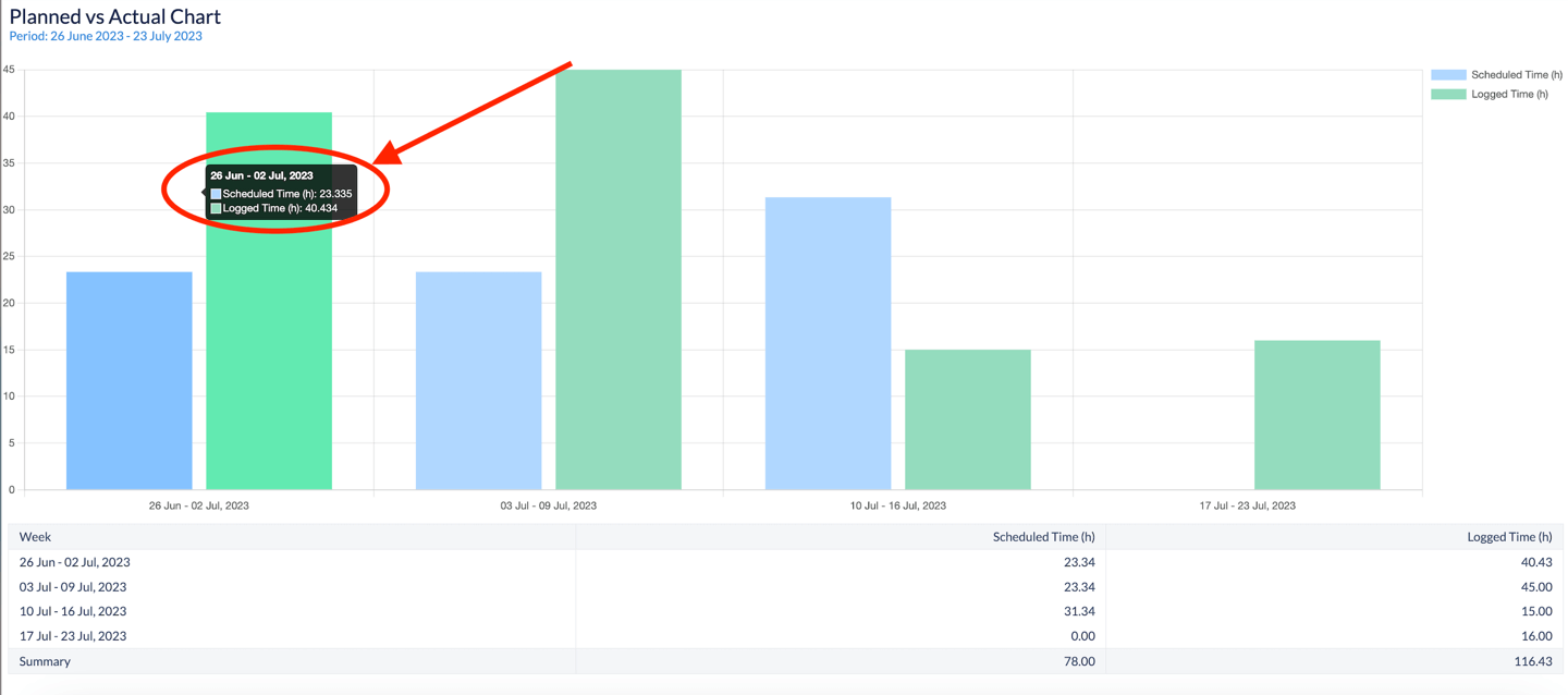
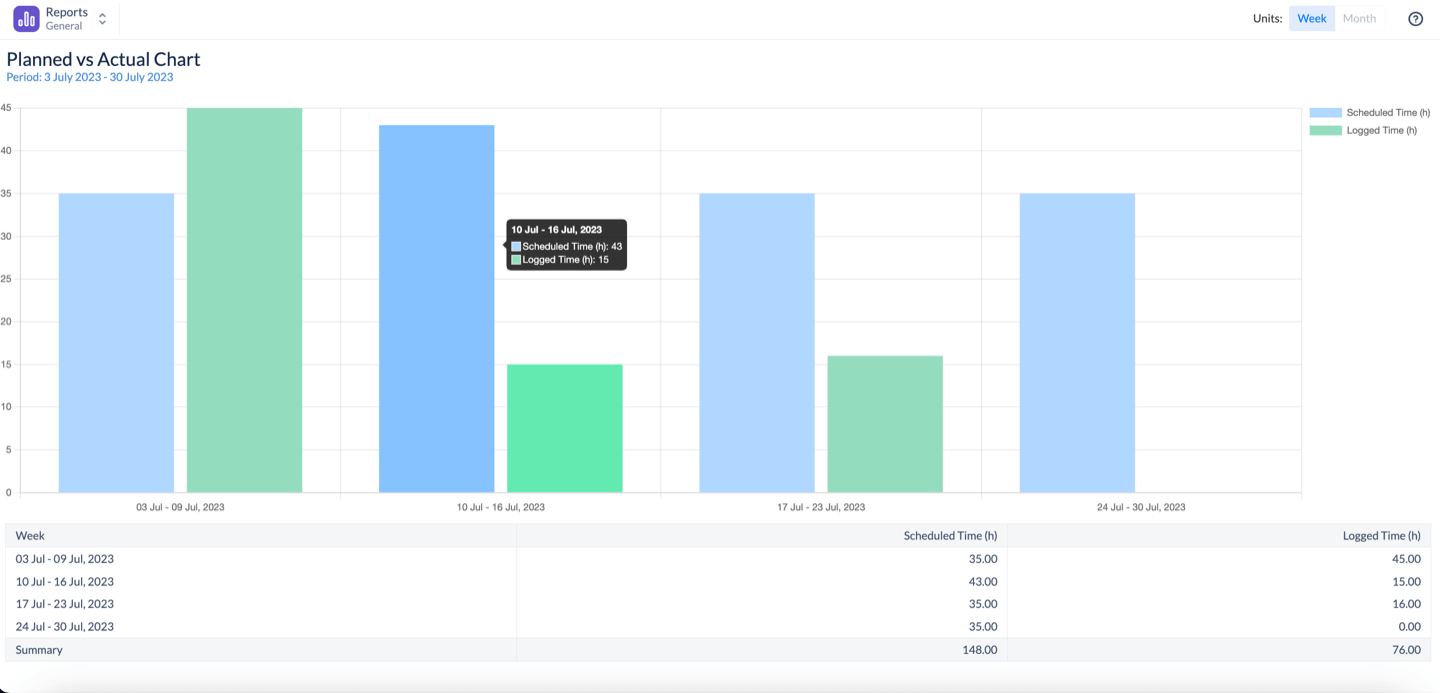
Scheduled Time: This represents the amount of work that was scheduled for the team across various projects. This is based on the Original estimate of Jira issues, ActivityTimeline Bookings & Placeholders.
-
Logged Time: Depicts the hours that were actually worked by the team, giving a real-world picture of the team's output based on time submitted through Log Work dialogue (either in Jira or in ActivityTimeline).
Chart Generation
-
Selecting the Reporting Criteria
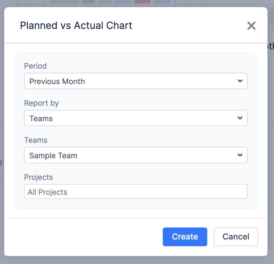
To generate the Team Capacity Chart, configure the following parameters:
-
Period: Choose the time frame for the report from a predefined list (e.g., Next 10 Weeks)
-
Report By: You can decide what team, projects, or epics to report on, to see how planned compared to Actual. If reporting by the team, you’ll also see the Team Available Capacity for the period and how it compared with the planned.
-
Teams: If “Team” is selected in the “Report By” field, specify which team the report should be generated for.
-
Projects: If “Project” is selected in the “Report By” field, specify whether the chart should include all projects or only a selected one.
-
Epics: If “Epic” is selected in the “Report By” field, specify which epic the chart should be generated for.
-
Jira filter: If “Jira Filter” is selected in the “Report By” field, specify which Jira Filter with its data set should be used to generate the chart.
-
Generating the Report
Once all parameters are configured, click the Create button. The system will generate a chart based on the selected criteria.
-
Customizing the Report After Creation
Once the chart is generated, you can further refine and adjust it dynamically by clicking on the
-
Modify the Team: Adjust the team selection if needed.
-
Change Display Units: Choose whether to view data by Week, or Month for better visualization.
-
Edit the Period: Change the reporting period or use the Custom Period option to define a specific timeframe.
-
Apply Filters: Options depend on the ‘Report by’ selection.
-
After making adjustments, click Apply to refresh the chart with updated settings in real-time.
-
Understanding the Chart Outcome
The chart provides a week-by-week or month-by-month breakdown of planned vs actual trends, helping teams:
-
Better tracking of planned vs actual work – Helps identify inconsistencies in estimates and execution.
-
The smart legend at the bottom of the page helps you read the chart's trends and understand it better.

Example.
For week 26 Jun - 02 Jul 2023 we planned to spend only around 23 hours per project, but instead, we spent over 40 hours, which means the initial estimate was incorrect and we are behind the schedule.