Team Capacity Chart is a visual tool designed to help managers and team leaders understand a team’s workload and availability over a specific period. It provides insights into total available capacity, utilized capacity, and remaining capacity, ensuring effective resource planning and workload distribution.
A key advantage of this chart is that it includes data from the Team Panel, ensuring accurate and up-to-date insights into team workload and resource distribution.
Chart Overview
Here’s what it does:
-
Workload and Availability Forecast: Team Capacity Chart provides a clear view of assigned workloads from Jira tasks, bookings, and calendar events while highlighting remaining availability by factoring in total capacity and non-working time.
-
Data Sources: The Team Capacity Chart includes data from:
-
Jira Tasks: Utilization based on the remaining estimates, daily estimates, or SP of assigned tasks to individuals in the team or on the team level.
-
Events: Includes bookings and placeholders added to the user’s timelines.
-
Non-Working Days: Considers vacations, holidays, and other scheduled time off.
-
Capacity Calculation:
-
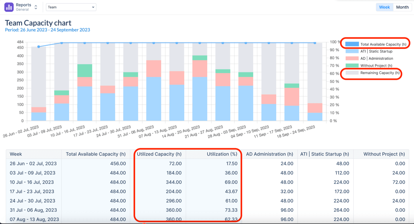
Total Available Capacity: This is a sum of the individual capacities of members of the team, considering all their non-working activities (e.g. days off, holidays, etc) and overtime.
-
Utilized Capacity: This is a sum of all the assigned workload on users from this team, which is based on the remaining estimate from Jira tasks, Bookings, Placeholders, and imported Calendar Events.
-
Remaining Capacity: This value shows the difference between the total available capacity & what’s already planned (utilized capacity).
-
Utilization Rate: Displays how much of the team’s capacity is planned within the selected period, shown as a percentage.
-
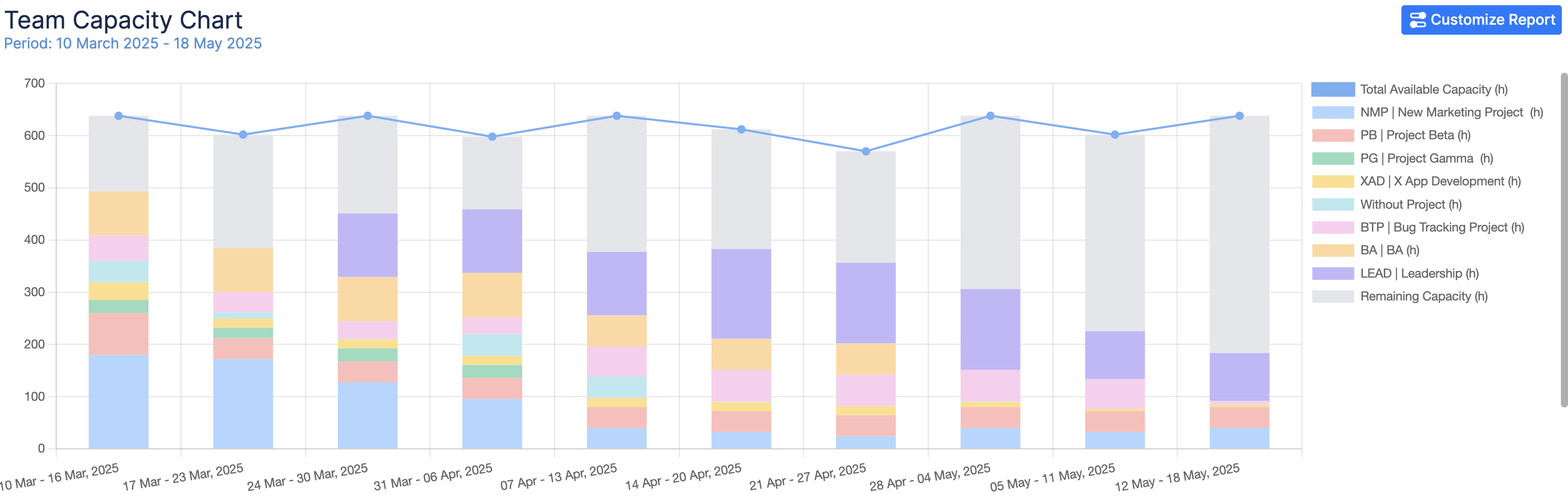
Future Utilization Trends: The report provides a week-by-week or month-by-month breakdown of utilization trends, helping teams:
-
Identify potential overutilization or underutilization in advance.
-
Adjust workload distribution for better resource management.
-
Ensure a balanced team workload while maintaining efficiency.
Chart Generation
1. Selecting the Reporting Criteria
To generate the Team Capacity Chart, configure the following parameters:
-
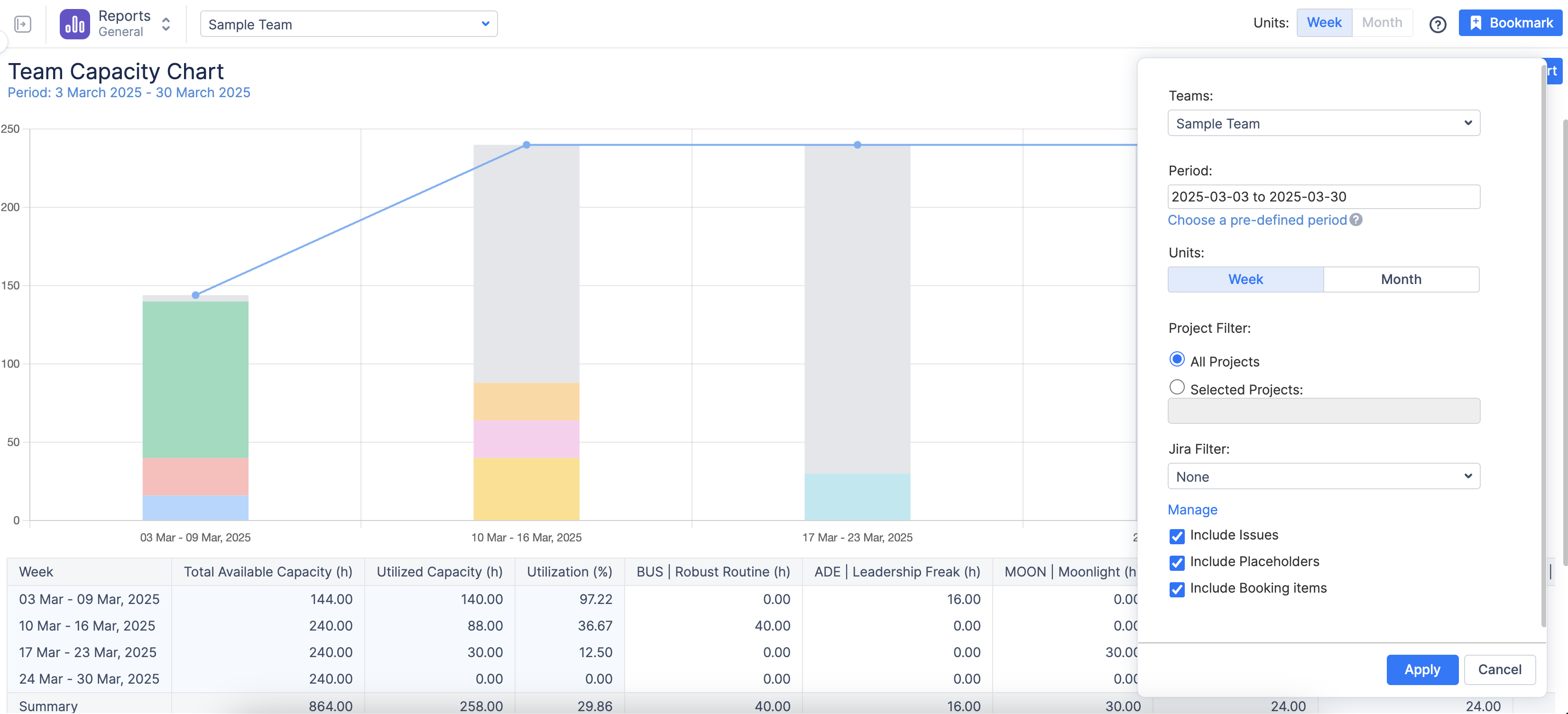
Period: Choose the time frame for the report from a predefined list (e.g., Next 10 Weeks)
-
Teams / People: Select the team for whom the report should be generated.
-
Report By: Defines the data source of the chart. By default, the report includes all scheduled activities for the selected user or team, but you can filter the data by: Project, or Jira Filter (to apply custom Jira queries).
-
Projects: If “Project” is selected in the “Report By” field, specify whether the chart should include all projects or only a selected one.
-
Group By: By default, the chart displays a breakdown per Project. However, enabling grouping allows further breakdown of data by Jira Custom Fields.

-
Generating the Report
Once all parameters are configured, click the Create button. The system will generate a chart based on the selected criteria.
-
Customizing the Report After Creation
Once the chart is generated, you can further refine and adjust it dynamically by clicking on the
-
Modify the Team: Adjust the team selection if needed.
-
Edit the Period: Change the reporting period or use the Custom Period option to define a specific timeframe.
-
Change Display Units: Choose whether to view data by Day, Week, or Month for better visualization.
-
Apply Filters: Modify Jira filters or project filters as needed.
-
Select Data Sources: Choose whether the chart should include: Jira Issues, Placeholders, or Bookings.
-
After making adjustments, click Apply to refresh the chart with updated settings in real-time.
-
Understanding the Chart Outcome
The chart provides a week-by-week or month-by-month breakdown of utilization trends, helping teams:
-
Identify potential overutilization or underutilization in advance.
-
Adjust workload distribution for better resource management.
-
Ensure a balanced team workload while maintaining efficiency.
-
The smart legend at the bottom of the page helps you read the chart's trends and understand it better.
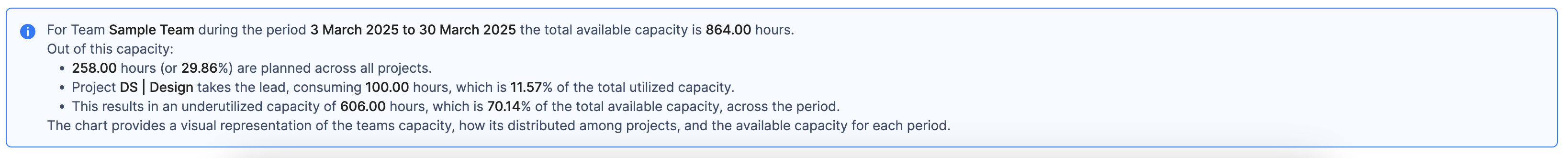
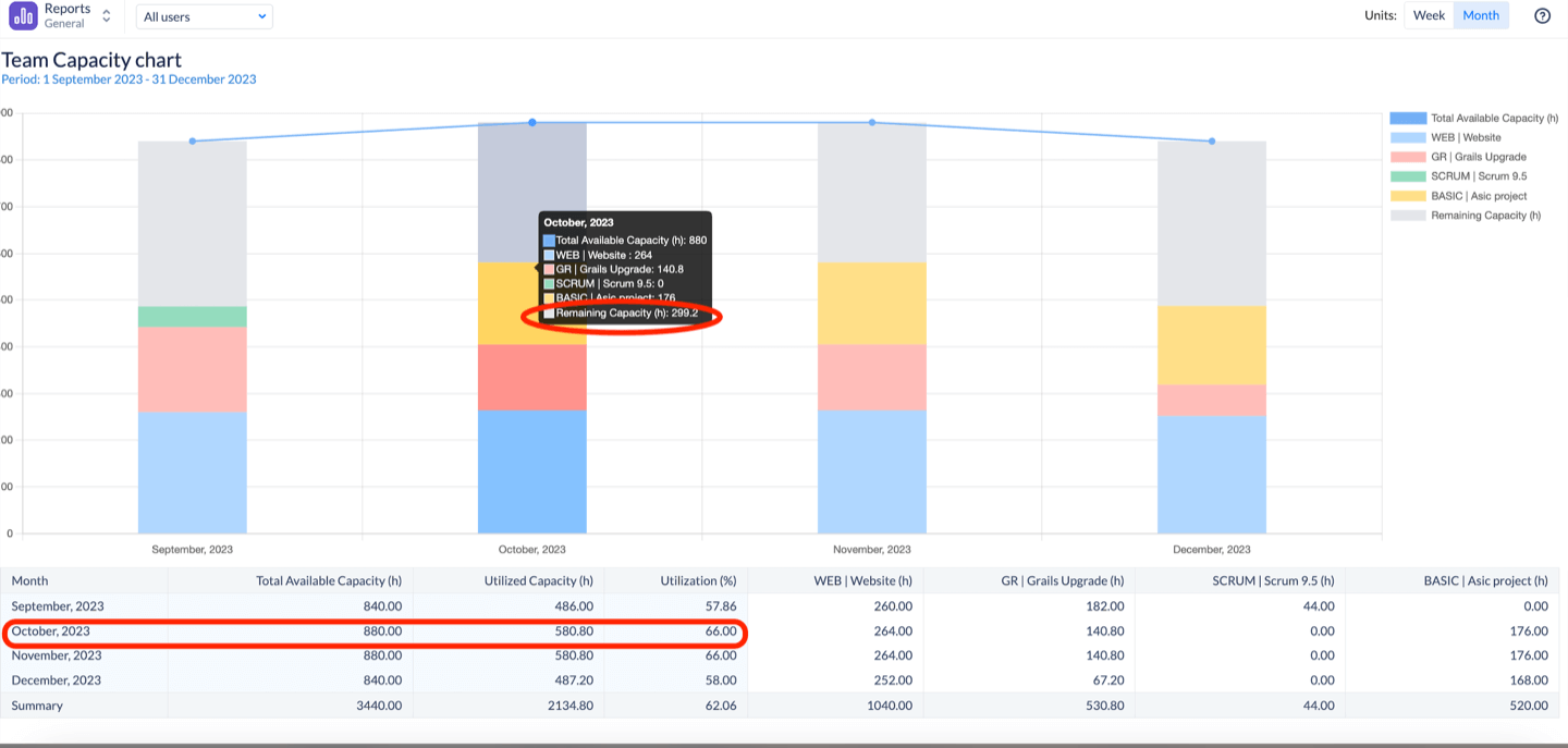
Example.
Looking at the screenshot below, you can see that in October, the team utilized approximately two-thirds of its total capacity (580.8 out of 880 hours), leaving nearly 300 hours available for additional work. To maximize productivity, we recommend aiming for at least 90% utilization.