
Overview
Starting from version v9.8.0+ ActivityTimeline includes several charts that help visualize planning, capacity, utilization, and project progress.
Charts provide a quick graphical overview of key metrics and complement the detailed reports available in the Reports module.
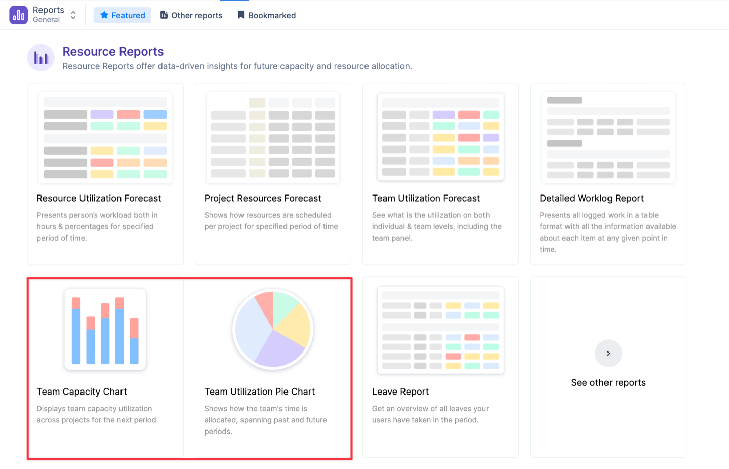
Available Charts
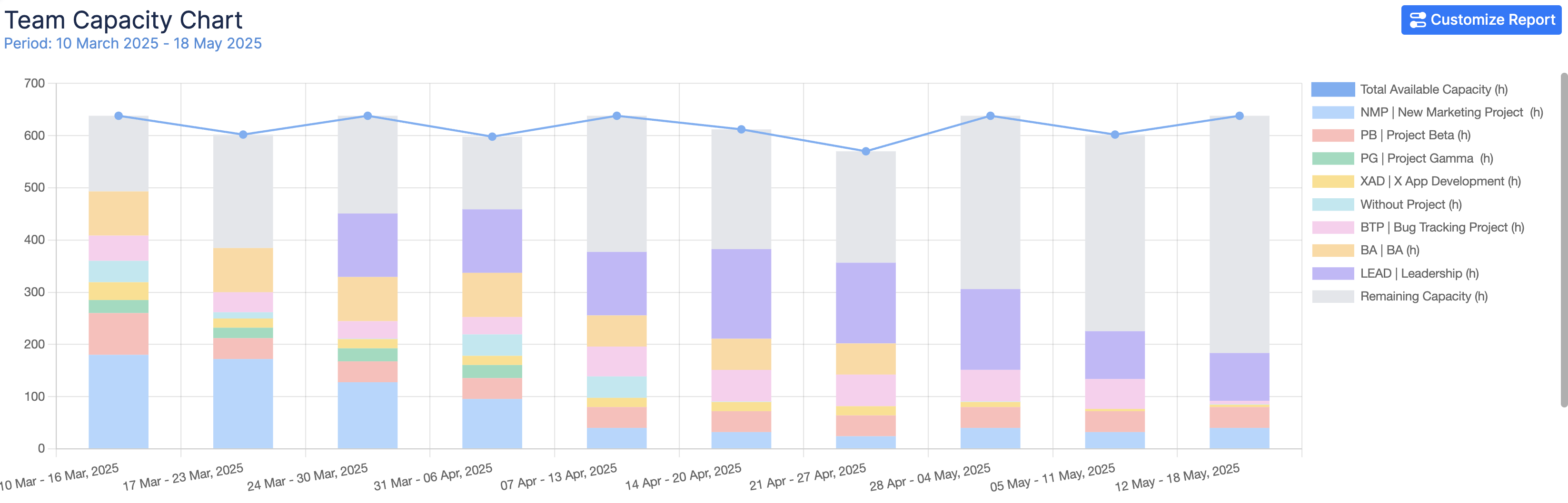
Team Capacity Chart
Shows team capacity, allocated workload, and remaining availability across projects over time.
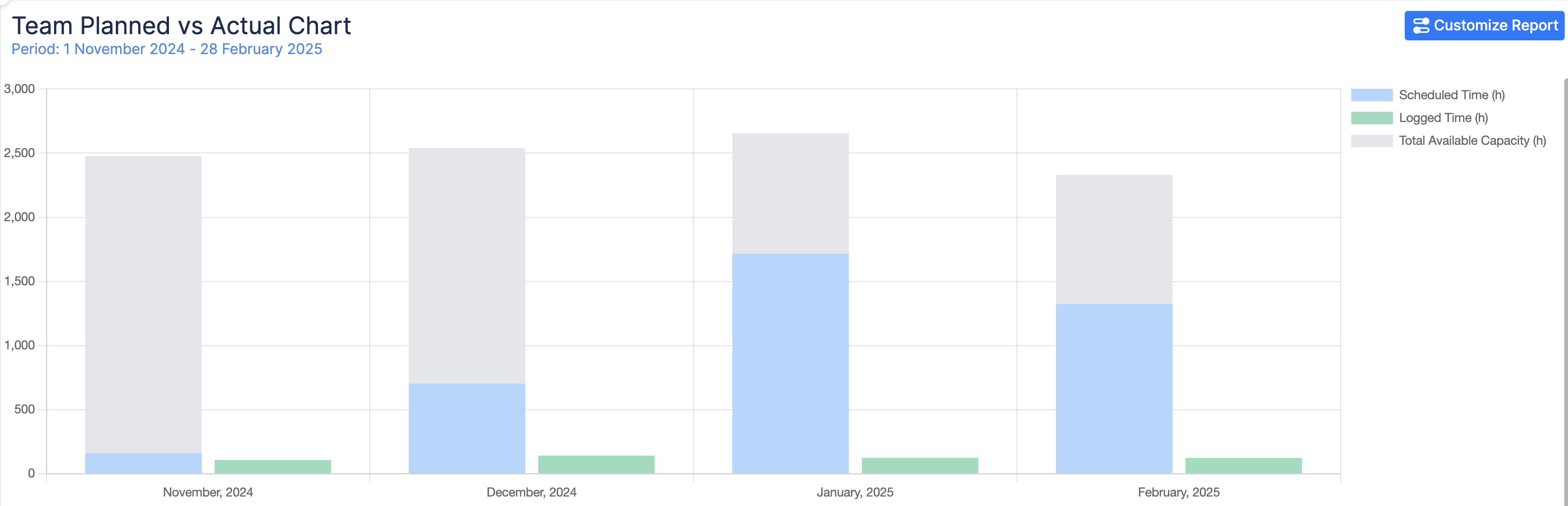
Planned vs Actual Chart
Compares planned work with actual execution to help identify deviations and bottlenecks.
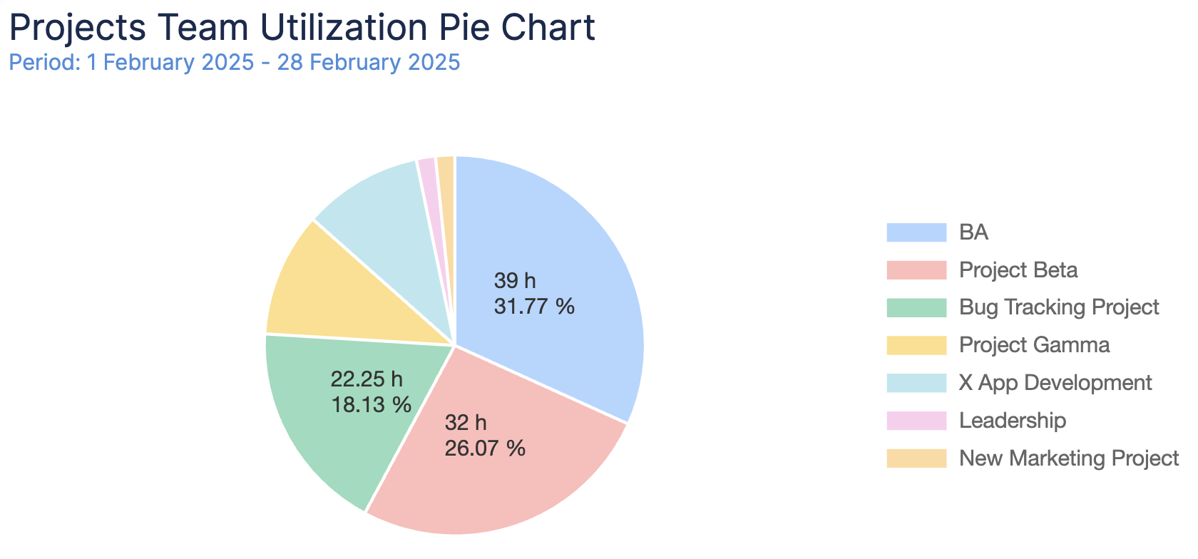
Team Utilization Pie Chart
Shows how team workload or time spent is distributed across projects for the selected period.
Learn More
Open each chart page to learn what it shows, how to configure it, and how to read the results.