
The Budget vs Spend report is the primary strategic comparison tool within the Finances module. It serves a single fundamental purpose: to verify if project expenditure aligns with the strategic financial plan.
By visualizing manual targets against real-time expenditure, the report identifies specific work categories, teams, or individual projects that are consuming resources disproportionately or exceeding their absolute financial caps.
Chart Display Modes
The report provides two distinct ways to visualize the comparison between planning and reality. Use the chart type switcher in the top-right corner to toggle between these analytical views:
1. Proportional Analysis (Pie Charts)
This mode displays two side-by-side pie charts. It is designed for relative comparison, focusing on the distribution of the budget.
-
Use Case: Ideal for answering, "What percentage of our total effort is going toward Development vs. Support?"
2. Absolute Analysis (Stacked Bar Charts)
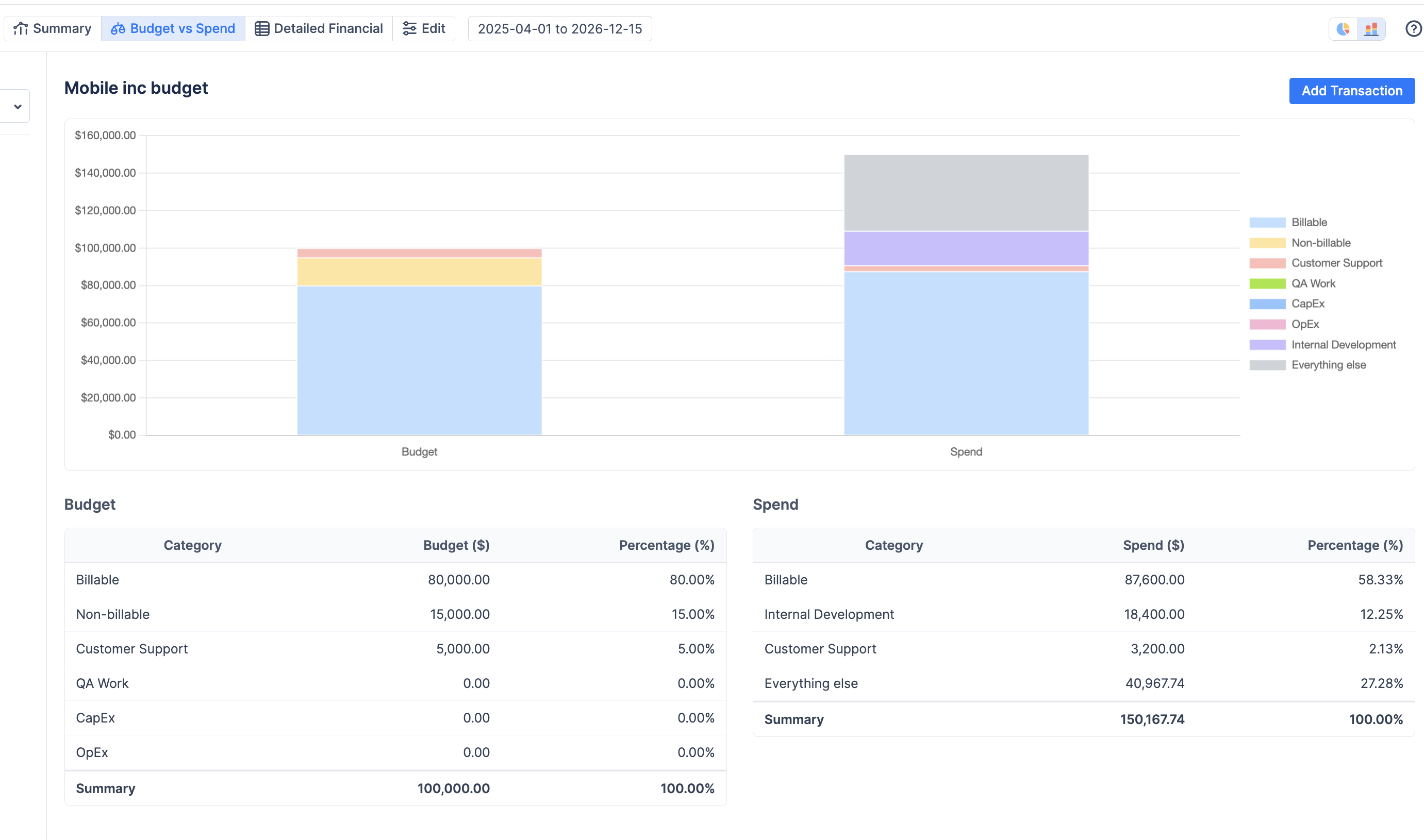
This mode displays two side-by-side stacked bar charts where the Y-axis represents the monetary value.
-
Use Case: Ideal for comparing actual money spent against the planned budget in absolute terms. It allows managers to see if the total volume of spend is approaching the total budget limit, regardless of the internal proportions.
Understanding the Charts
The dashboard is divided into two main sections: your plan (left) and your reality (right).
-
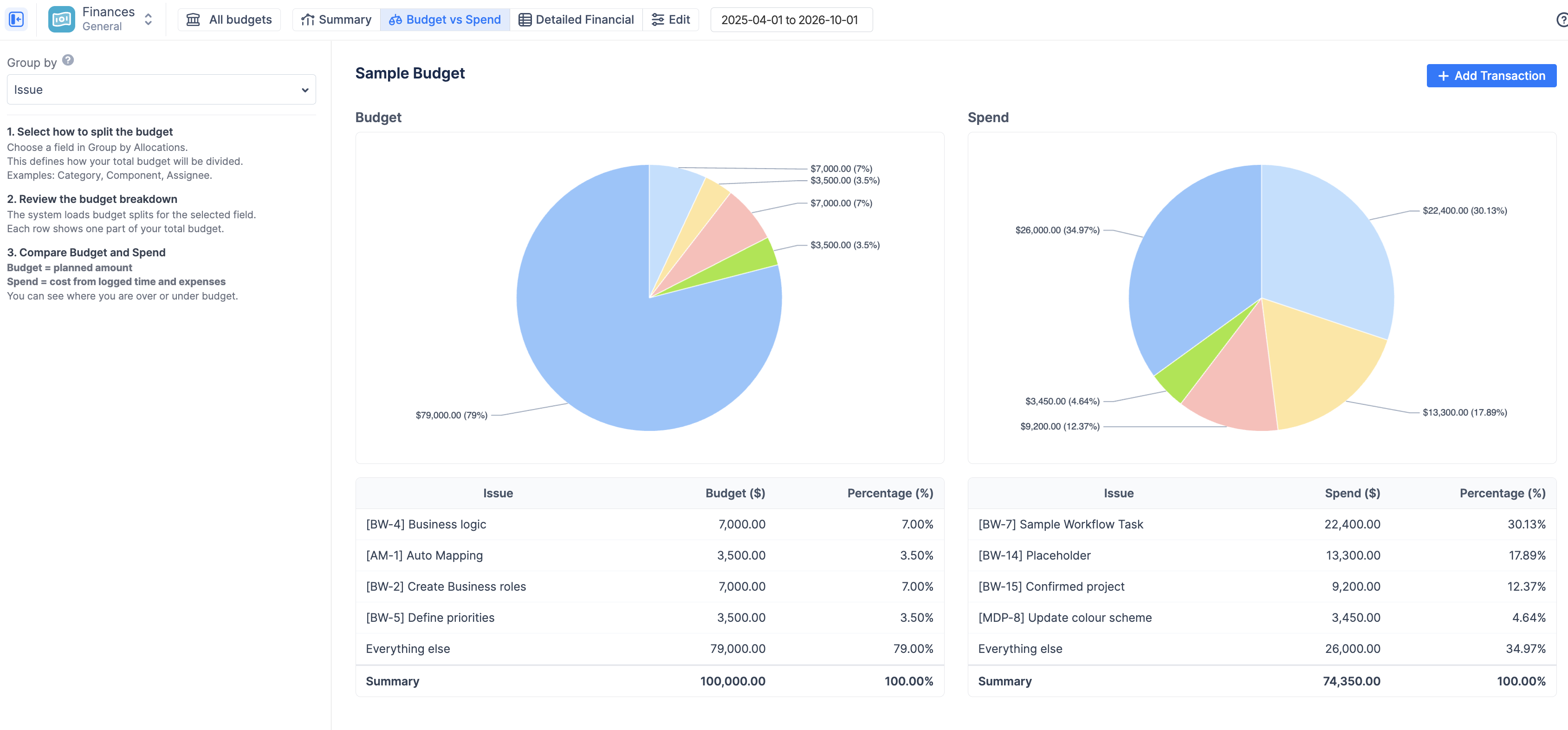
Budget (The Plan)
The left pie chart and table represent your Planned Allocations.
-
This data is not calculated from Jira estimates or worklogs.
-
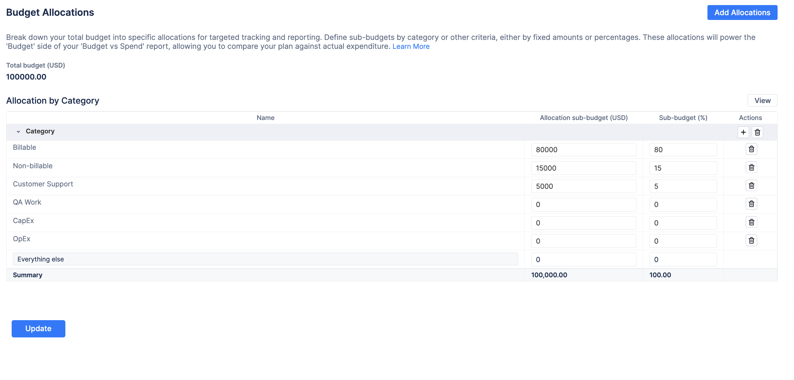
It is drawn directly from the manual targets you configured in the Budget Allocations settings.
-
It shows how you intended to divide your Total Budget across the dimension currently selected in the "Group by" dropdown.
💡 Important: If you have not configured Budget Allocations for the dimension currently selected in the "Group by" dropdown (e.g., if you group by "Component" but haven't set up component targets), this chart will display a "No data source" warning. Click the Set Budget Allocations button to define your targets.
-
Spend (The Reality)
Spend (The Reality)
The right chart and table represent the Actual Spend.
-
Source: This is a real-time calculation summing all incurred costs: (Logged Jira Hours × Applicable Cost Rate) + Manually Entered Fixed Expenses.
-
Function: It automatically categorizes these costs based on the dimension selected in the "Group by" dropdown, allowing for an immediate audit of where money is actually flowing.
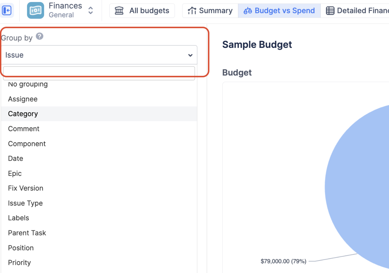
How to Use the "Group by" Filter?
The true power of this report lies in the Group by dropdown on the left panel. By changing this selection, you change the lens through which you are analyzing your budget.
-
Select a Dimension: Choose how you want to split your data (e.g., by Category, Project, Epic, or Assignee).
-
Review the Plan: The Budget (Left) chart will load the specific manual allocations you defined for that dimension in your settings.
-
Analyze the Reality: The Spend (Right) chart will automatically recalculate and re-group your actual costs based on that new dimension.
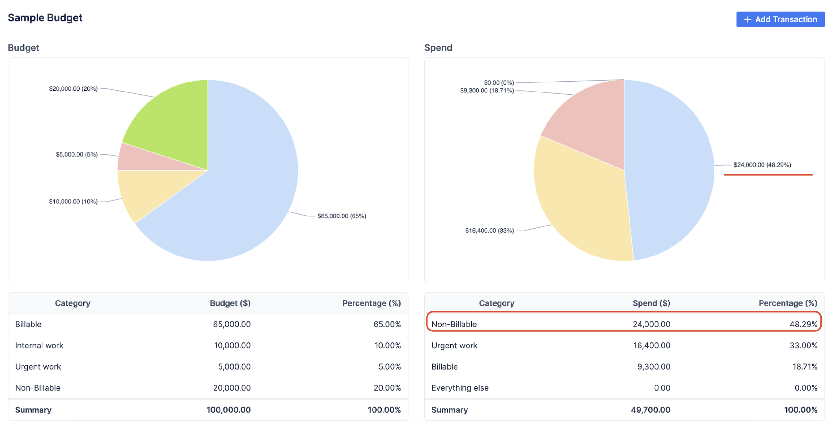
Example Use Case #1 (Pie Chart)
Let's say you allocated your $100,000 budget by Category, planning to spend not more than 20% on "Non-Billable" activities.
You select "Category" from the Group by dropdown. The Left chart confirms your plan. However, the Right chart reveals that as of now the “non-billable” currently accounts for more than 48% of your actual spend. This visual discrepancy immediately alerts you that your team is spending too much time on internal work and not enough on billable client projects, allowing you to take corrective action before the budget is exhausted.
Example Use Case #2 (Bar Chart vs Pie chart)
Analytical Example: The Danger of Relative Proportions
Consider a scenario where a manager sets a total budget of $100,000 with a strategic target to keep Billable work at 80% ($80,000) of the total cost.
-
Relative View (Pie Chart): When checking the Spend pie chart, the manager sees that 82.39% of the current spend is "Billable." At first glance, this suggests the project is healthy and exceeding the efficiency target.
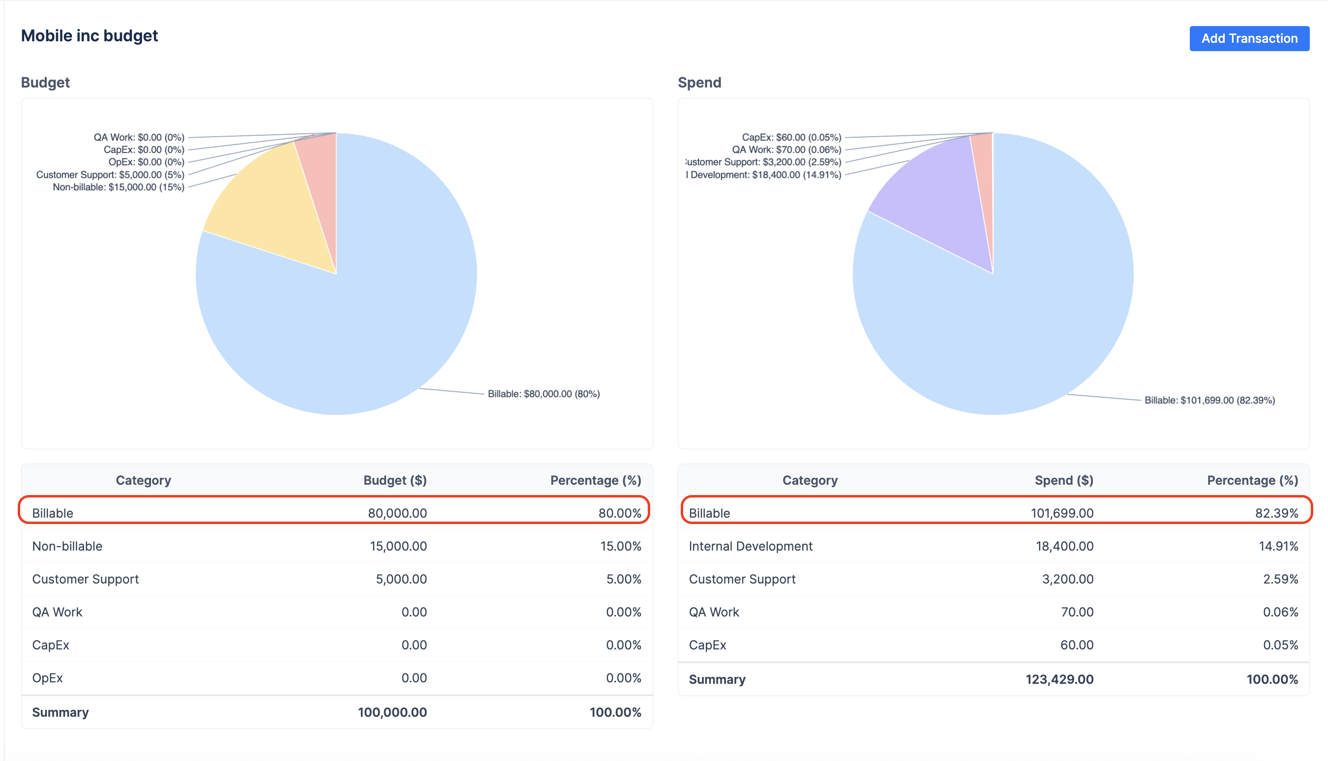
At first glance, it looks good, billables are even higher than expected!
-
Absolute View (Bar Chart): Upon switching to the Bar Chart view, the Y-axis reveals a different reality. While the proportion of billable work is correct, the Total Spend has ballooned to $123,429.
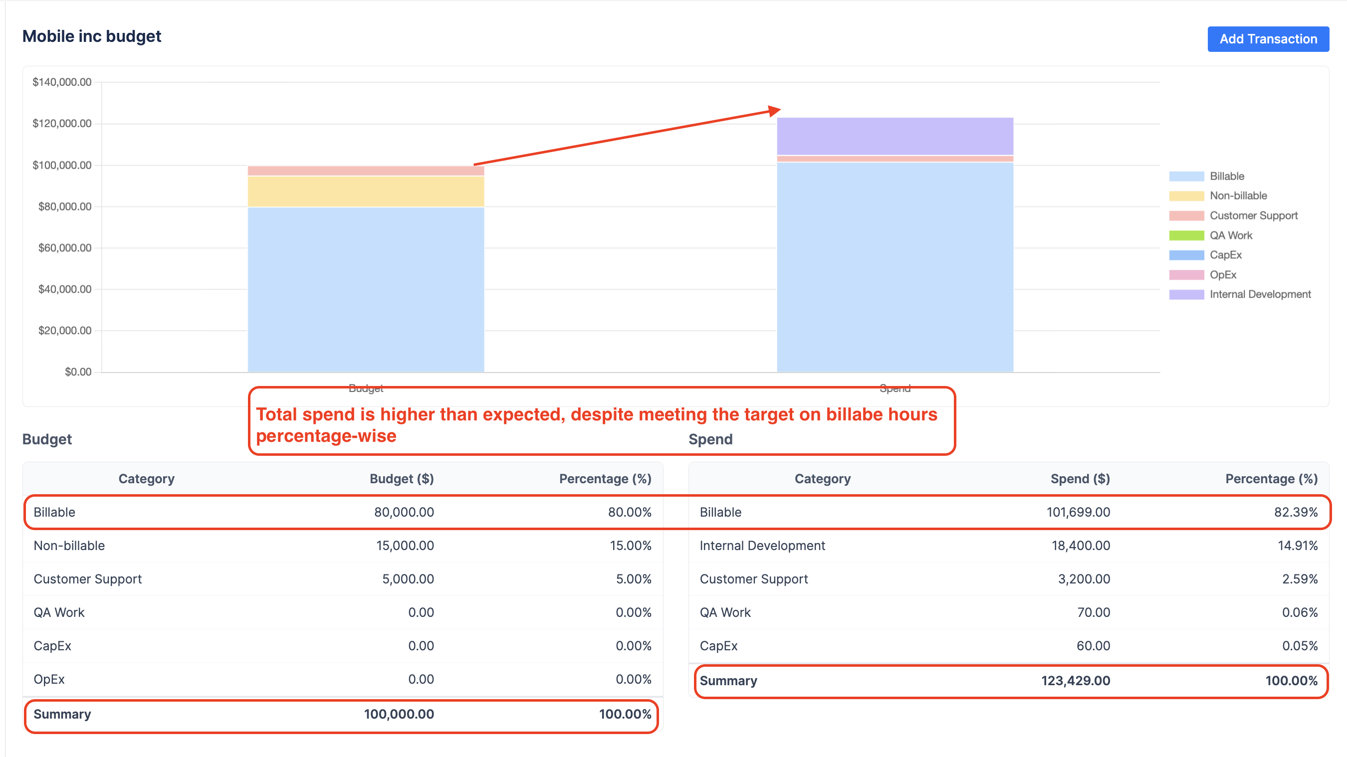
important The Strategic Insight: The pie chart masked the overspending because the ratio remained stable. The bar chart clarifies that the team has already spent $101,699 on billable work alone—exceeding the entire intended billable budget by over $21,000. Without the absolute view, the manager might not have noticed that the project has significantly exceeded its total financial cap despite "meeting" its percentage-based efficiency goals.